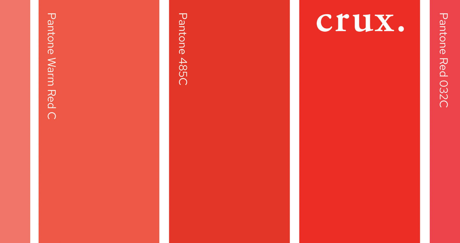
If you were expecting advice on locating a good cab or pinot noir, that’s not what this article is about (although we wouldn’t blame one for thinking that—at Crux we do love our red wine!). No, this is the story of why color consistency is so important to your brand, and how Crux found its signature red color.
Imagine showing up to a meeting with a few of your colleagues, and when you hand out your business cards the first thing the prospect does is place them side by side and comment on how the colors don’t match. Or, what if you attend a trade show and the bright, fire engine red you thought you ordered for your table skirt actually turned out to be orange? And what if those business cards you reordered (because the reds didn’t match) turned out slightly darker, even though they were sent to the same online printer? All of these things happened to Crux.
Why color consistency is so important (or, not all reds are created equal).
Companies spend vast amounts of time and money ensuring color accuracy from application to application, and to match their brand strategy. Many brands (even entire industries) are often identified and associated with specific colors.
Red is a popular color for brands because it signifies strength, passion and confidence, while also quickly grabbing viewers’ attention. Some of the most iconic brands, including Coca-Cola, Target and McDonald’s, all use red. This is also why red was the perfect choice for Crux—we cut through all the bull to get straight to the heart of our clients’ challenges.
This boldness and passion for client brands, as well as the fact that our founder “bleeds” Nebraska Husker Red, are the genesis of our signature color. However, not all reds are created equal. If the red hue is slightly off, it could connote entirely different characteristics, as outlined in Imagibrand’s infographic, “The Psychology of Branding with Color: Red.”
How to ensure color consistency, time after time.
As Crux learned from our own experience, some colors (red in particular) are simply harder than others to consistently reproduce. How they appear (on-screen or in print), any surrounding elements or colors, the material they’re printed on, and even temperature and humidity when printed can all affect how color appears. To top it all off, lighting conditions when and where the brand is viewed can also be a factor in creating inconsistent color issues. That’s why red, along with some dark blues, can be particularly tricky to reproduce.
Working with your marketing or design team to specify approved color formulas is the best way to ensure color consistency for your brand. While these formulas may look and sound like a foreign language, they determine how a color will appear on-screen (RGB), when printed (CMYK), or on the web (Hex, or hexadecimal). Designers will specify spot colors using the Pantone® Color Matching System (PMS), which are specially formulated inks for use on coated or uncoated sheets of paper, fabric and other applications.
Color is complicated.
We’ve only scratched the surface of the importance of color for your brand. There are many other considerations (which the average person probably doesn’t geek out on as much as our creative team), but we would love the opportunity to talk more about it—perhaps over a glass of good red (Cabernet, of course).


